


Introduction
Creating an affinity diagram is another useful way to organise and synthesize user insights. This helps us to begin to group and organise common themes and patterns from across the user group(s) and feed into Ideation. It is a particularly helpful method for analysing insights from usability testing.
Where possible this exercise is best done as a team to avoid unconscious bias and add other perspectives.
Benefits of Affinity Mapping:
- can be a useful way for designers to really understand users’ pain points and needs.
- Involves lots of team collaboration and sharing of ideas
- A faster method of analysis with a high-quality output
- Creates a shared understanding
- Gives everyone the opportunity to input
- Can be used in a whole range of contexts such as brainstorming sessions, not just user research
Where to start
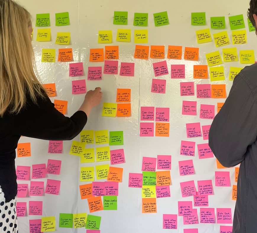
Affinity mapping can be done physically with post-it notes and a whiteboard or wall, or with digital stickies on a Miro board.
Make a sticky for every insight. See the observing user research page for information on taking notes and what to look out for. Tips for writing up the Stickies for this activity:
- Colour code your stickies, for example, one colour for each participant or each type of insight.
- Add one note per interaction, quote, pain point, missed interaction, behaviour, observation and so on
- Try to add as many insights as possible from each session
Organising the insights
(60 mins+ depending on the scale and attendees)
Once you have all of your stickies on the board:
- Begin to look for common themes, for example, you might find and bring together two stickies that relate to users not being able to find the map
- Organise your insights into top-level clusters or groups and give them a title. It doesn’t matter at this stage what you title the groupings, just as long as they make sense to everyone involved.
- Don’t forget to discuss patterns you see emerging as you go.
Once you have grouped all the stickies, take a photo or copy of this first iteration just in case you want it later.
Affinity Diagram
(60-90 mins depending on the scale and attendees)
At this stage, you should review and discuss your groupings. You might find that some groups have multiple sub-themes and can be broken down further. You can also agree on more appropriate titles for the groupings, review interpretation and summarize your groupings.
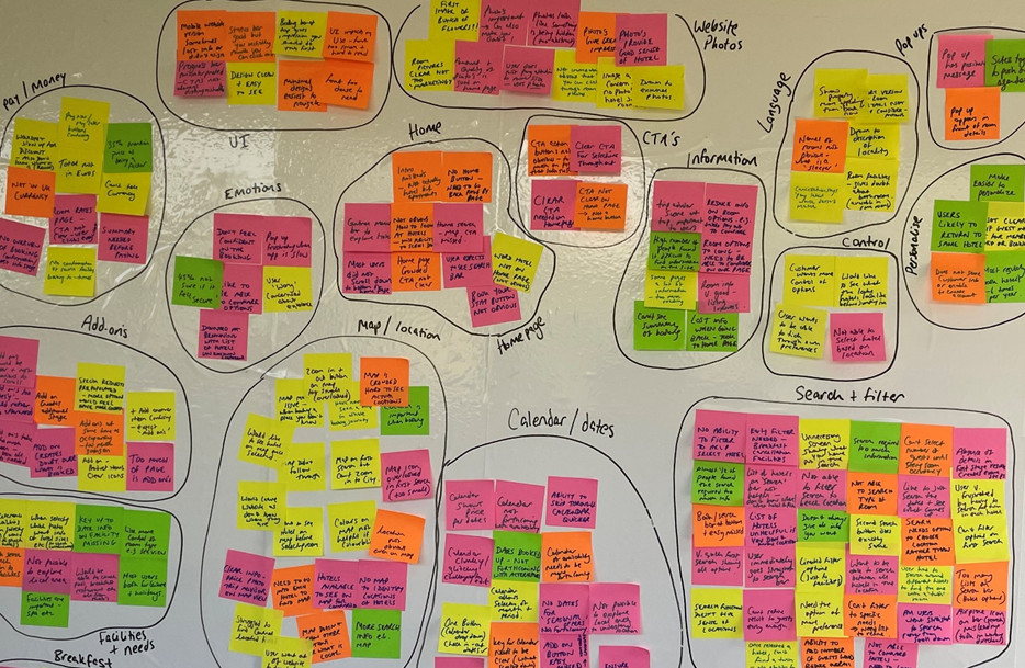
Stage 1
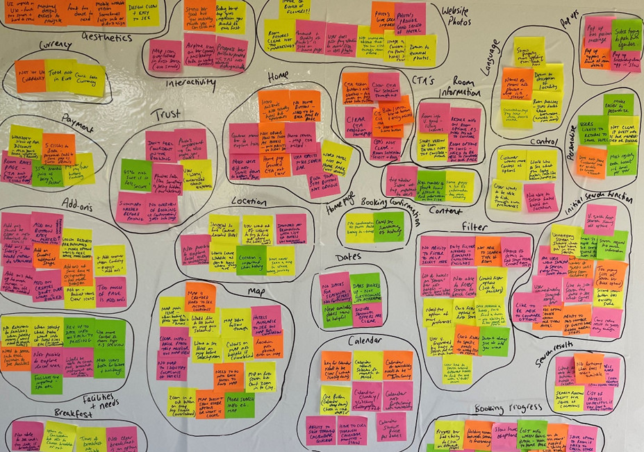
Stage 2
What next?
(30 mins depending on the scale and attendees)
From here you should spend some time discussing key themes, determining your priorities and planning your next steps.
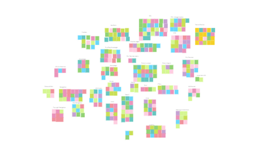
Depending on the purpose, at this stage creating a third iteration can help to begin organising this into a high-level user flow to aid Ideation. For example, the order in which you could experience these in the high-level flow through a website to complete a task.
Stage 2 – Miro example
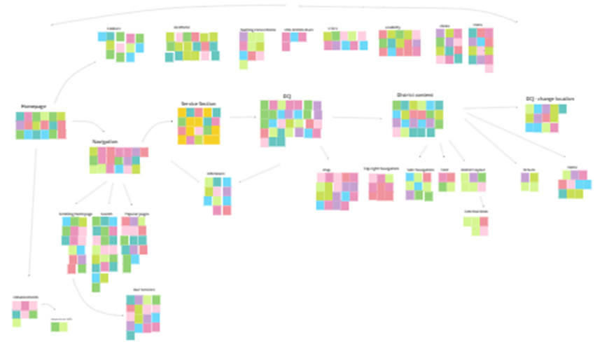
Stage 3 – Miro example