


Overview
To ensure consistency and reinforce recognition, the following colour palette should be used in core council communications and materials.
The palette is made up of three levels: the primary palette, the secondary palette and the highlight palette.
Primary palette
The primary colours are cool blues and white; these are the colours present in our logo and most easily associated with our brand. Colours from the primary palette should always be present.
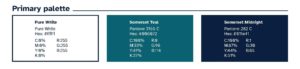
Pure White
- Hex code: #ffffff
- CMYK: C:0%, M:0%, Y:0%, K:0%
- RGB: R:255, G:255, B:255
Somerset Teal
- Pantone: 3155 C
- Hex code: #006072
- CMYK: C:100%, M:33%, Y:41%, K:27%
- RGB: R:0, G:96, B:114
Somerset Midnight
- Pantone: 282 C
- Hex code: #011e41
- CMYK: C:100%, M:87%, Y:44%, K:51%
- RGB: R:1, G:30, B:65
Secondary palette
The secondary colours are cool tones from the same side of the colour spectrum as the primary blues, which can be used to support the primary palette without contrasting too heavily.
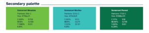
Somerset Meadow
- Pantone: 368 C
- Hex code: #76bc21
- CMYK: C:60%, M:0%, Y:100%, K:0%
- RGB: R:118, G:188, B:33
Somerset Marine
- Pantone: 3255 C
- Hex code: #19d3c5
- CMYK: C:66%, M:0%, Y:33%, K:0%
- RGB: R:25, G:211, B:197
Somerset Forest
- Pantone: 7733 C
- Hex code: #006e43
- CMYK: C:91%, M:30%, Y:86%, K:20%
- RGB: R:0, G:110, B:67
Highlight palette
The highlight colours are punchy warm tones, which may be used to contrast against the cooler primary and secondary colours – these colours should be used sparingly to draw attention to a specific element or piece of information.
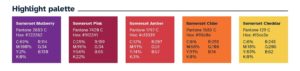
Somerset Mulberry
- Pantone: 2603 C
- Hex code: #722282
- CMYK: C:69%, M:100%, Y:2%, K:0%
- RGB: R:114, G:34, B:130
Somerset Pink
- Pantone: 7420 C
- Hex code: #9f2241
- CMYK: C:25%, M:96%, Y:56%, K:22%
- RGB: R:159, G:34, B:65
Somerset Amber
- Pantone: 1797 C
- Hex code: #cf3339
- CMYK: C:12%, M:91%, Y:74%, K:3%
- RGB: R:207, G:51, B:57
Somerset Cider
- Pantone: 1585 C
- Hex code: #ff6c0e
- CMYK: C:0%, M:68%, Y:91%, K:0%
- RGB: R:255, G:108, B:14
Somerset Cheddar
- Pantone: 129 C
- Hex code: #f5ce3e
- CMYK: C:6%, M:18%, Y:83%, K:0%
- RGB: R:245, G:206, B:62
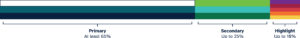
Colour balance
Colour coverage is determined by its palette level – Primary, Secondary or Highlight.
- Primary palette colours should aim to account for at least 65% coverage
- Secondary palette colours should account for 25% coverage
- Highlight palette colours should only account for up to 10% coverage
Tints
To increase the range, tints of all palette colours may be used. Tints should always be a multiple of 20 (100% / 80% / 60% / 40% / 20%).
Colours from the primary palette should always outweigh the use of tints, in line with the colour balance guidelines above.
If text is being used on top of the colour, make sure to check the accessibility of tints against WCAG accessibility grades.
How to use colour combinations
Below is a list of the accepted colour combinations for text and background colours on our websites. If the colour being used does not contain any text the rules do not apply. There is separate guidance for colour usage on charts.
White text only
The following may only be used with white text when used as a background colour:
- Somerset Teal
- Somerset Mulberry
- Somerset Pink
Somerset Midnight
Somerset midnight is the most versatile of our brand colours and can be used in combination with the following colours:
- White
- Somerset Cheddar
- Somerset Meadow
- Somerset Marine
Black or Somerset Midnight text only
The following colours may only be used with black or Somerset Midnight text when used as background colours
- Somerset Meadow
- Somerset Marine
- Somerset Cheddar
Somerset Cider
Somerset Cider may only be used with black text.
Do not use
Somerset Forest (dark green) and Somerset Amber (red) are not used on our website. This type of dark green and red is reserved for alerts and user interface buttons and should not be used for design purposes.