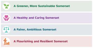
Our key messages
Council messaging is driven by the Council Plan which sets out the ambitions of the Council for the period 2023 – 2027. It is not necessary to quote the Plan, but everyone preparing communications for an external audience should be aware of the key priorities of the council.

Our tone of voice
The way we speak and write says a lot about who we are
We want to be very clear about what we are saying, and our communication style will be:
- Active
- Straightforward
- Human
- Polite
- Authoritative
- Impartial
Copywriting consistency
Go to the content section of the playbook for guidance on
- Grammar and punctuation
- Numbers, dates and times
- Symbols, currency and abbreviations
Accessibility
Somerset Council aims to write and design content that is accessible to everyone who wishes to access it, regardless of any impairment or disability they may have.
Sometimes we will need to produce information in different ways for people to make sure all those using the Council’s services are able to understand the information.
To ensure readability, text should:
- Be displayed at a minimum of 12pt and displayed in the correct font as described in the typography section
- Not be displayed using italics, underlines or block capitals
- Displayed on a clear, contrasting background in an accessible colour pairing (see the Colour accessibility matrix) – design elements must not overlap or intersect text.
- Be displayed in a single column
- Be left-aligned (and not justified)
You can find more detailed information in our accessibility area.


