

Overview
We use a combination of two fonts for our digital services, body text uses the web font Source sans pro and heading elements use Atkinson Hyperlegible. Atkinson Hyperlegible was specially design by the Braille Institute for readability for people with vision impairments, and is also the font used in our logo.
Where either font is not supported by a browser or device, we default to ‘Arial’ as an alternative.
Type sizes and styling
Body
Paragraph styling applies to all none heading elements with some unique differences for different elements. Our fonts must have a minimum size of 1rem.
Headings
Write all headings in sentence case.
Use appropriate heading levels depending on the location of the heading. Headings should never be chosen for their visual size or styling. If you need a heading styled differently to be used correctly, please contact the Digital Transformation Team. Below you can see examples of the standard size and styling of our heading levels.
<h1> – Page title
<h2> – Page or content section title
<h3> – Content subtitle
<h4> – Content subtitle
<h5> – Content subtitle
<h6> – Content subtitle
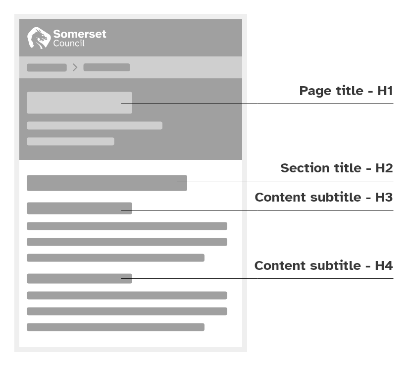
Below is an example of how we use header elements on a standard content page. In the diagram you can see that the main header uses a “H1” which is the primary level of heading. The main sections of the page use “H2”, the secondary level of heading, and within those sections any sub-headings would use “H3” or “H4”. Headings should always be nested within the next level, so for example H3’s can only be used within H2 subjects. For more information on properly using Headings please visit our Writing content headings correctly page.
Font weights
Our digital services use the bold weight of Atkinson Hyperlegible and multiple weights of Source Sans Pro.
Atkinson Hyperlegible – Bold (700)
- Source sans pro – Regular (400)
- Source sans pro – Semibold (600)
- Source sans pro – Bold (700)
- Source sans pro – Underline (700 and underlined)