

Overview
Images can be used to enhance the look and feel of your service website, and can help customers to know which elements they can interact with. They are most commonly used on the front page, or section landing pages, to help customers find the page they need.
Image formatting
Images should be in the RGB colour format. They should display at no less than 72dpi resolution, and have a width between 1000-2000px.
Image orientation
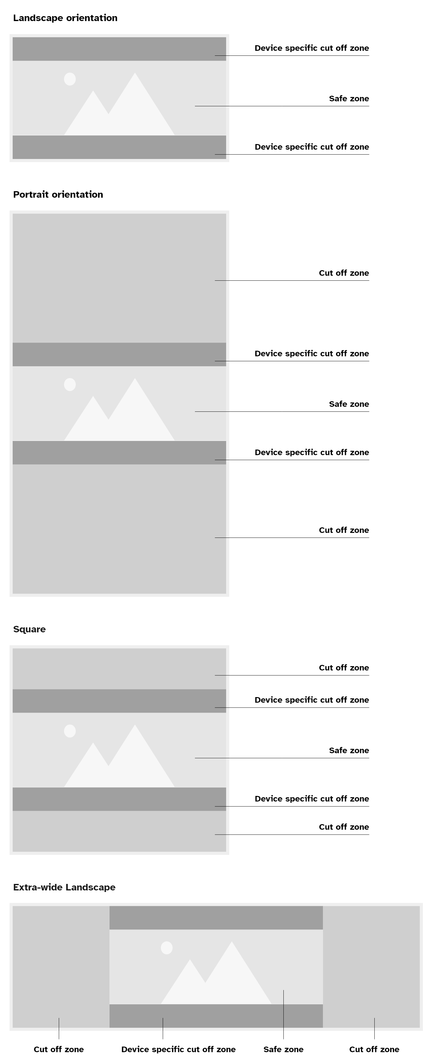
Landscape orientation is wider than it is tall, and portrait orientation is taller than it is wide. We recommend using landscape images on the website because they fit more naturally within most page layouts, such as page headers.
Using a landscape image helps reduce how much of the image might be cropped, but some cropping will always happen depending on the customer’s device and screen size.
The example diagram below shows the areas of an image that are most likely to be cut off. The shaded areas at the top and bottom mark the parts at highest risk of cropping. The centre area is the “safe zone”, where you should place the most important elements of your image. Please note that if your image is very wide the sides may also be at risk of being cropped on smaller screens, as well as the top and bottom.
File size
The file size of an image can affect the load speed of a page, make sure to use the “Save for Web” function in your image editor to keep the file size as small as possible, and choose an appropriate format.
Photography
Use photography when it is important to show a lifelike representation of something. For example, showing a representation of a particular subsection of your service.
Try to avoid using generic stock photography in your service, or photography that is already being used elsewhere on the website. Try to find images that would feel local and familiar to a Somerset resident.
Images that contain text
Please avoid using images that contain text. Wherever possible, write the text directly on the page instead. This is because text inside an image can be hard to read, especially for people using screen readers or those who need to change how text looks (for example, increasing size or changing colours). WCAG guidelines say that if you can present the text normally, you should not place it inside an image.
When text in an image is not a problem
It is fine to use an image that happens to include text naturally as part of a scene. In these cases, the text is not the focus – it is just something captured in the background.
For example:
- a photo of a library where book covers and signs are visible
- a tourism collage that includes a local landmark sign
- an illustration of a Somerset street with shop signs in the background
These images are acceptable because you have not added the text manually, and the meaning of the image does not depend on that text. Always check that the image genuinely adds value or meaning, and is not purely decorative.
Essential text in images
There are a few rare situations where it is okay to use an image that contains text.
Text is considered “essential” if:
- the text provides important meaning or context
- removing the text would change what the image is trying to communicate
In these situations, you cannot express the same information in any other way. The text has to appear in that exact visual style for the content to make sense.
Examples of essential text:
- a shopfront where showing the exact style of the store’s sign matters
- text inside a logo
- a handwritten signature
- a diagram or chart where the text forms part of the visual information
- a type specimen where the purpose is to show what a font looks like
WCAG allows these cases because the text’s appearance is part of the meaning and cannot be separated.
Best practice when essential text appears in images
Even if text is essential, you should make the image as accessible as possible.
- Use written text elsewhere on the page if it helps users understand the same information – for example provide a written description of the data underneath an image of a chart
- Make sure the text in the image has strong contrast with the background to meet WCAG level AA contrast requirements
Possible alternatives
If you can avoid putting text inside an image, consider using HTML text over an image. Placing normal text on top of an image using HTML and CSS allows users to zoom, recolour and adjust the text, just like regular content.
You must make sure the contrast between the text colour and every part of the underlying image is high enough on all screen sizes. For example, on our headers we include a colour gradient between the text and the image, to give the text a plain colour to sit on and increase readability.
Text in charts, diagrams and complex images
Charts, diagrams and complex visuals often contain a lot of text. Before creating one, ask yourself: Could this information be explained just as well using a table or regular text?
If the image is needed, you must provide both:
- short alt text that explains the overall purpose of the image
- a longer description directly underneath the image that includes all important details
Images descriptions must be visible and usable by everyone, not just as alt-text which can only be read by assistive technology.
Do not promote events using a poster image, these are designed for print purposes not the web, and contain lots of inaccessible text. Instead, create an event on the website that lists the details accessibly.
Some charts and diagrams can be built in an accessible way using HTML, CSS, JavaScript or SVG. Accessible charts and diagrams must make the data within the chart available as text.
Alt text
Alternative text (alt text) is a brief written description of what the image looks like, that cannot be seen on the web page or article but can be read out to the customer by assistive technology so that they can understand it.
Good alt text:
- tells people what is happening in the image
- describes the content and function of the image
- describes the emotion being conveyed by the image
- is specific, meaningful and concise
- uses normal punctuation, like commas and full stops, so the text is easy to read and understand
Do not write alt text that:
- includes the name of the photographer or person who created the image
- starts with “Image of”, “Graphic of” or common information that would repeat across every image, because the screen reader is already going to announce that the element is an image.
- It is fine to explain if the image is an illustration or a photograph, if it is relevant to understand its purpose
- It is fine to explain if a photograph is in black and white or sepia. But it is not necessary to always specify that it is in colour as this is the assumed default
- repeats information from the page
- includes extra information not in the image